Friday 27 May 2011

TATTOO

For my tattoo I decided to choose my portrait with the darker background as I thought that would make it easier to blend the tattoo naturally onto the face.

This was the first version that I did:
I think it was too metallic. My dad thought it looked real but thought it was face paint.

So in my next attempt, I changed the green to a grey because I wanted to mimic that tattoo colour. I really didn't like this one because I felt the lighting was all wrong.


For my next attempt I changed the contrast and cropped the image. I also removed the shine from my cheeks.

I felt that everything was too dark, particularly my hair. The texture was lost so I changed the exposure. I like this image because it has two tones.

I wasn't sure if the colours were right so I changed it to a darker colour. This is my final image:

PORTFOLIO - photoshopping

Following on from last time, I realised I didn't have to wrap the pink wafer texture to the legs because I was going to put the 100's and 1000's texture on as if they were leggings:


I then warped the image of a wafer biscuit to create a skirt:

I thought maybe the body language was a bit boring in the photo I chose, so I looked for another image and I found the one below. I also started new with the pink wafer texture. I decided to not wrap any of the skin. I thought it would be interesting to have a 2D vs 3D effect in my images i.e. the skin would be flat and 2D but the clothes would be more 3D.

After I covered both legs in the 100's and 1000's texture it didn't look right because of everything being flat the viewer wouldn't be able to tell where the other leg is. So I changed the legs so that they were crisscrossing while the model jumps in mid-air: 

I didn't work on this image for quite a few days. It was the last one I completed. For the background I used a closeup of the surface of a pink marshmellow. I used the wafer biscuit to create a floaty/corset-top type outfit. To do these I used layer masks. I duplicated the whole figure and then used skew and perspective to create the shadow.

My friends suggested that I get rid of the cracks in the pink wafer so I used the spot healing tool. I also used the burn tool on the dress near the waist. I added lots of motion blur to the shadow and decreased the opacity. I added 1 for opacity for the figure and this is my final image:


For my next image I used the texture of cocoa powder for the skin. Turning down the opacity and using a layer mask I was able to outline the texture to the body shape:

I used the closeup of fairy floss texture as the background. I chose the fairy floss because I like how it complimented the soft, squishy marshmellow dress that would be in this image.

The dress was difficult to create. I used this image for the marshmellows to build the dress:

First I did the bust and ribs then draped the marshmellows over the knee area:

I replaced the chair with a large-scale cube of licorice:

I extended the dress because I wanted it to be a really dramatic and long dress:

I was always planning to put melted chocolate sauce somewhere in the image. I experimented a bit before I decided to have it on the floor:

I changed the orientation of the image to vertical, to accentuate the length of the dress. I then merged the layers of the dress together ready for liquifying.

I used a layer mask to mix the layer of fairy floss with the melted chocolate - to make it appear seemless. I tried to liquify afterwards but the computer froze and it wasn't possible to liquify without me having to restart. So I used dodge and burn as best I could, even though I knew it wouldn't create the same effect as the liquify tool:

I added some more final touches using settings such as hue/saturation, curves, colour balance etc:

The most difficult part for compositing this image would probably be the folding of the dress at the knees. I received feedback that the figure looked like it was standing and was holding the dress up - but not sitting down with the knees up. That was the biggest challenge. Using the burn tool I tried to create subtle shadows where the dress would bend, so hopefully I have succeeded in depicting the model sitting down.

This is my final image:

For the last image I used ice cream as the skin texture. You can see in the image below that I have used a layer mask and turned down the opacity to shape the legs:

I used a single image of a sour strap to create the flowing skirt. I warped each strip to fit the body.

I took an image of ice cream that I had microwaved and placed it at the bottom of the image so that it appeared as if the figure was dancing or standing on fairy floss with melting ice cream at the base. I took an image of a white marshmellow and scaled it up so that it would become the background. I then altered increased the contrast and brightened the marshmellow surface, the fairy floss and the ice cream skin. I changed the vibrantness of the melted icecream but didn't touch the sour strap dress as I felt it was the colour that made the image most interesting.

This is my final image:

These are my three images as a screencap from my desktop:

Sunday 22 May 2011

PORTFOLIO - idea blog 1

Last Saturday I went to the supermarket and bought lots of candy. I came up with some sketches that would help me visualise what the final images would look like.


Last Sunday I photographed the candy and myself as the model using a Canon 550D camera from the Resource Centre.

In class I re-labelled all the files to make it easier for me to see what photos I had available to composite since I took 299 photos.

I used a layer mask to replace the skin with the texture of pink wafer:


I used a separate layer for each body part e.g. one for right leg, right thigh, left forearm, left arm and individually warped the surface to match the contour of the body.


Saturday 14 May 2011

PORTFOLIO - references 3

I still haven't been able to come up with a solid idea in the past few days. I tried to brainstorm just then. I think I've been approaching the Portfolio project in the wrong way. I've spent the past few weeks just trying to visualise an image in my head that would be my final photographs. But I think I should be thinking of one thing that interests me or inspires me then go from there, instead of trying to come up with the entire image all in one go.

So I wrote down what I'm interested in and what inspires me. I wrote: models, fashion, flowers, colour, fun.

Then I brainstomed and came up with: Shoe made out of marshmellows, Dress made out of lollies and model that would be shot at a small scale and with alien like models.

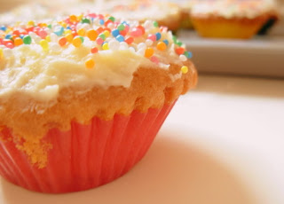
Then I thought of doing shots of models made out of candy and wearing candy clothing. I was thinking of taking photographs of hundreds and thousands and then wrapping them to the body, like in tattoo project. I was inspired by these images of people with hundreds and thousands on their lips:


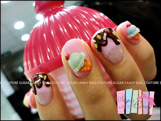
Also, images of people with candy-inspired nail art:


Inspired by fashion as well, like this dress by Prada and shoes somebody covered with candy for a party:


This stick-on-the-wall art was also interesting in its colours and scale:


I was thinking of covering the model's skin with different types of candy such as hundreds and thousands sprinkles, though underneath you would still see some gaps of skin. I had a look at some different type of textures that could underlay the sprinkles such as runny icing or solid icing as well as baked cookies and icecream. These images also helped me to see what colours would go well together. I want the viewer to be intrigued by my images and think about how delicious it would be to be made out of candy or to be covered in candy.


I am greatly inspired by fashion - mainly fashion photography and seeing the way the body can be manipulated to create interesting shapes or silouhettes, and the drapery of fabric, the texture and way it falls inspires me. These are some images that I really like:


I thought about what I would do with the model's hair. I imagined something with really dramatic big hair and I thought of Medusa who had snakes for hair:


I like this picture because the figure is swamped by a mass of hair:


This is a really bad drawing of a really simple, basic idea for what I imagine one of my works to look like:

I want the facial features to still come through on the model's face because I want it to look human except made out of candy.

One of the main elements of this series of photos will be cotton candy. It seems very versatile and has a wonderful colour combination (blue and pink). I was thinking of "combing" it like hair and then braiding it. Or creating a flowing gown out of it. Or using it for the background to create a dreamscape.